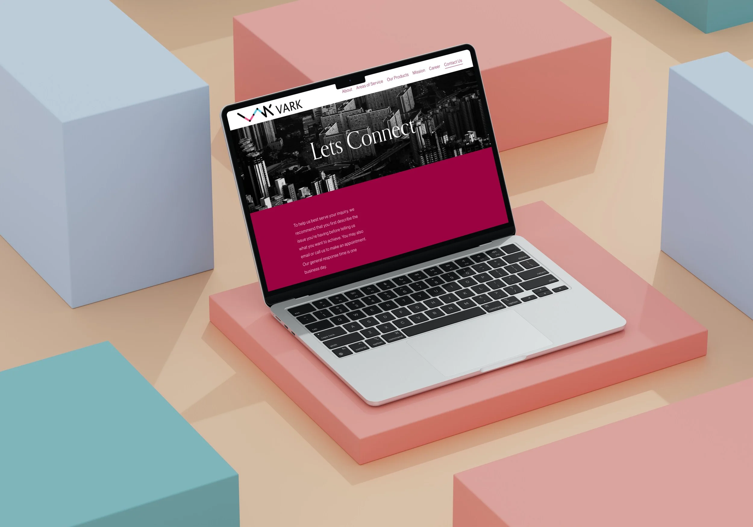
VARK
USER EXPERIENCE DESIGN, USER INTERFACE DESIGN, GRAPHIC DESIGN
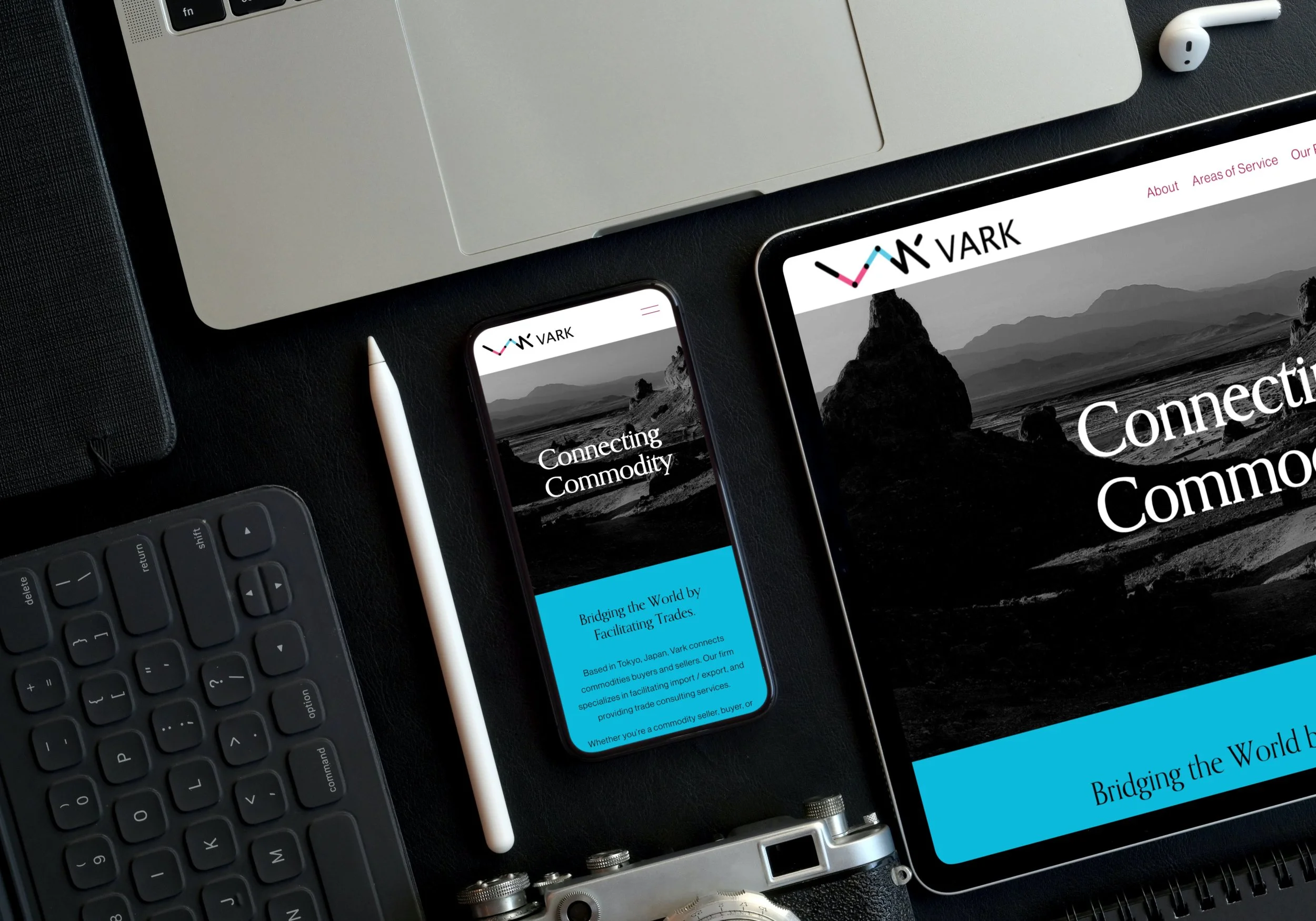
USER EXPERIENCE AND INTERFACE design for VARK, a PRODUCT DISTRIBUTION COMPANY FROM JAPAN WITH THE MISSION TO INCREASE BRAND AWARENESS VIA A STRONG DIGITAL USER EXPERIENCE.
Design Brief
Designing the user-centered website for Vark - a product distribution company from Japan is an essential part of its overall marketing and sales strategy.
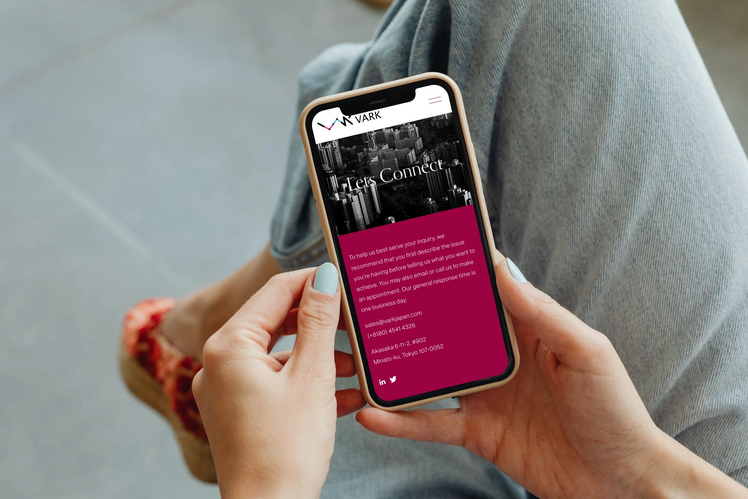
To design a user-centered interface that allows current and future Vark customers to learn about the company and its services. Furthermore also be a platform from which potential future clients and current clients can communicate with the Vark team effectively.
The Challenge
Research: The first step in designing a website for a product distribution company is to conduct research on the target audience and their needs. We started by analyzing the company's existing customer data to understand their behavior, preferences, and pain points. We also conducted user surveys and interviews to gather feedback and insights into their expectations and needs for a product distribution company website.
Design: Based on our research findings, we developed a user-centered design that focused on usability, accessibility, and efficiency. We created wireframes and prototypes to test the design with users and iterated based on their feedback.
Navigation: We designed a clear and intuitive navigation structure that made it easy for users to find the information they needed. We used a hierarchy of categories and subcategories to organize the content, and included search functionality to help users find specific products or information.
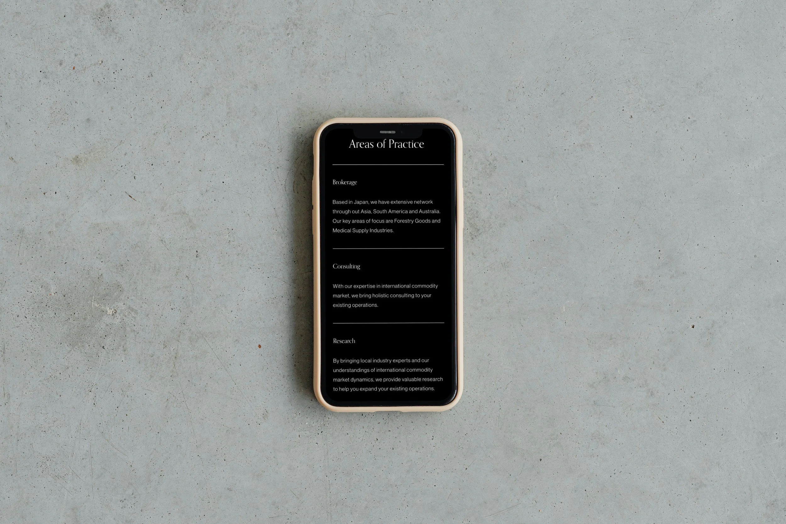
Visual Design: We used a clean and modern visual design that reflected the company's brand and values. We used a color palette and typography that were easy on the eyes and legible, and included images and graphics that conveyed the company's professionalism and reliability.
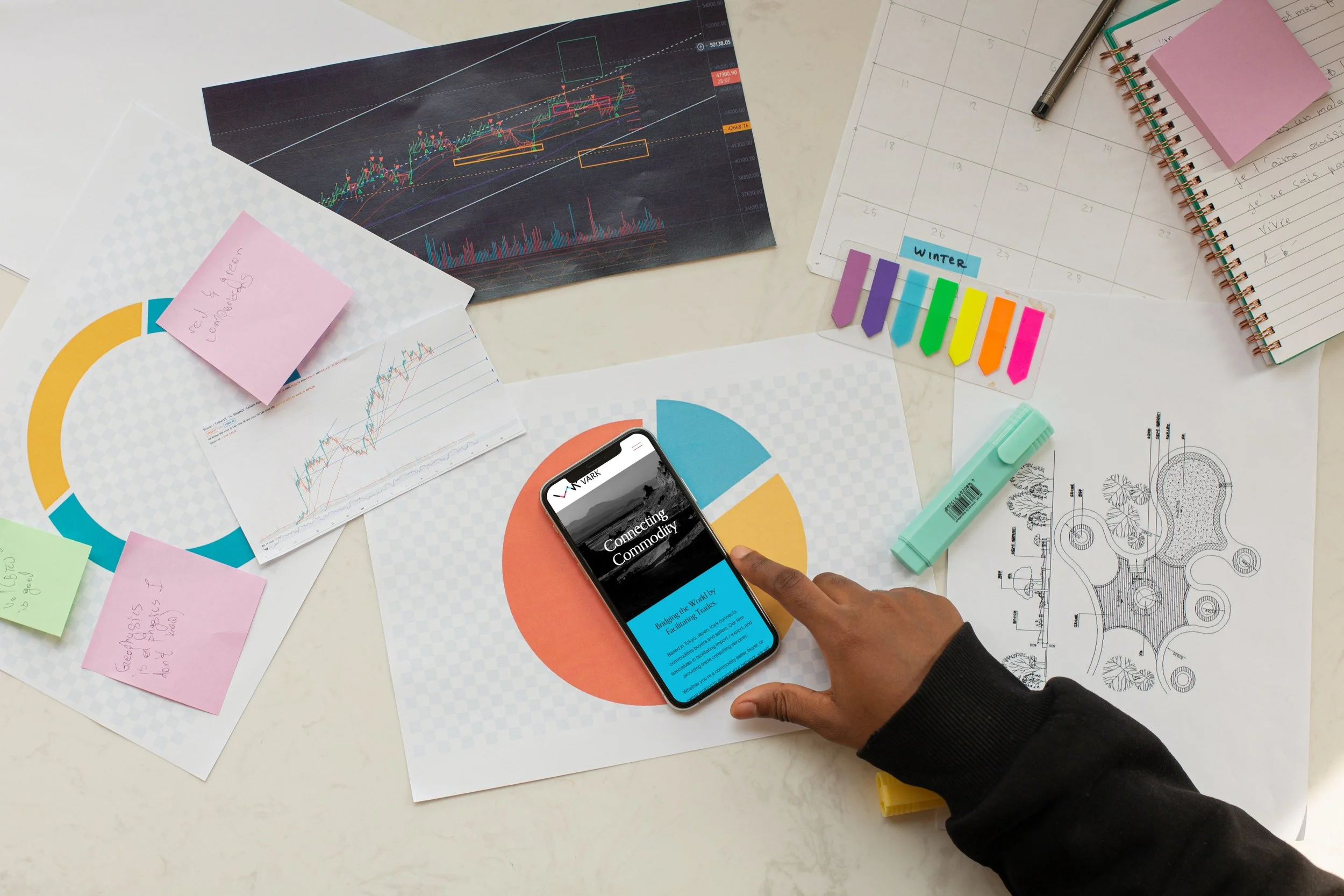
Mobile Responsiveness: We designed the website to be responsive, so that it could be easily accessed and used on mobile devices. We optimized the design for smaller screens and included touch-friendly navigation and interactions.
Research: The first step in designing a website for a product distribution company is to research the target audience and their needs. We started by analyzing the company's existing customer data to understand their behavior, preferences, and pain points. We also conducted user surveys and interviews to gather feedback and insights into their expectations and needs for a product distribution company website.
Design: Based on our research findings, we developed a user-centered design that focused on usability, accessibility, and efficiency. We created wireframes and prototypes to test the design with users and iterated based on their feedback.
Navigation: We designed a clear and intuitive navigation structure that made it easy for users to find the information they needed. We used a hierarchy of categories and subcategories to organize the content and included search functionality to help users find specific products or information.
Visual Design: We used a clean and modern visual design that reflected the company's brand and values. We used a color palette and typography that were easy on the eyes and legible and included images and graphics that conveyed the company's professionalism and reliability.
Mobile Responsiveness: We designed the website to be responsive so that it could be easily accessed and used on mobile devices. We optimized the design for smaller screens and included touch-friendly navigation and interactions.
Implementation: Once the design was finalized, we implemented it using a content management system (CMS) that allowed the company to easily manage and update the website content. We also ensured that the website was optimized for search engine optimization (SEO) and that it complied with accessibility standards.
The Strategy
The Solution
By conducting research, designing a user-centered interface, and implementing a responsive and accessible design, we were able to create a website that met the needs and expectations of the target audience and helped the company achieve its business objectives. The result increased website traffic, user engagement, and sales, which contributed to the company's growth and success.
